Organizing Your Retro Game Collection by Aesthetics and Color

Most collectors assume that organizing a collection by alphabetical order or release date is the only "correct" way to manage a library. It isn't. While alphabetical sorting is great for finding a specific title quickly, it ignores the visual reality of what we actually collect: physical objects. This post explores how to organize your retro game collection by aesthetics and color to turn a messy shelf of plastic into a curated display. We'll look at the technical requirements for color-coded grouping and how to maintain the integrity of your assets while doing so.
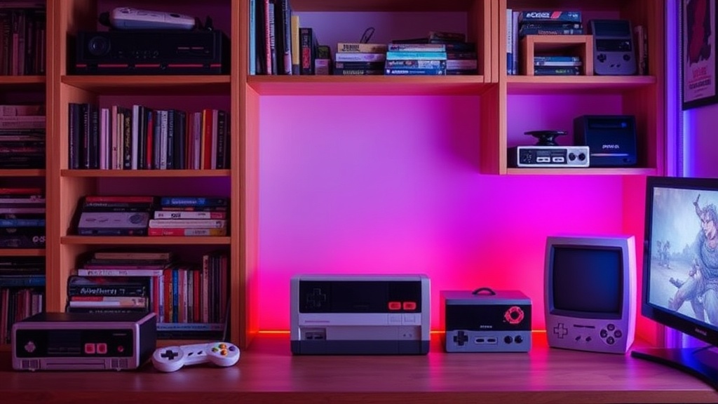
Color-coding isn't just about making things look pretty for a social media photo. It's a way to categorize by era, manufacturer, or even hardware generation. A shelf of translucent Game Boy Color cartridges looks fundamentally different from a row of solid-colored SNES cartridges. When you treat these items as assets, the way you display them matters.
Why Should You Organize Games by Color?
Organizing by color allows you to group hardware generations and manufacturer aesthetics together, creating a more cohesive visual narrative of gaming history.
Think about the way Nintendo approached hardware design. The transition from the gray, utilitarian look of the NES to the vibrant, multicolored shells of the N64 wasn't accidental. If you group your collection by color, you naturally group by era. A section of "Nintendo Gray" creates a sense of historical continuity. A section of "Sega Blue" highlights a specific brand identity. It turns a disorganized pile of plastic into a timeline.
It also helps with visual weight. If you have a heavy collection of dark-colored cartridges—think PlayStation 1 or Sega Saturn—placing them at the bottom of a shelf provides a sense of "grounding." It keeps the display from looking top-heavy or cluttered. (And let's be honest, it looks much better when you're showing it off.)
One thing to keep in mind: color-coding requires more frequent handling. If you're constantly digging through a pile to find a specific title, you're increasing the risk of scuffing the labels or the shell. To prevent this, I suggest using high-quality dividers or specialized storage solutions. You can check out my previous piece on selecting the right case for retro cartridge storage if you're worried about shelf-wear during reorganization.
How Do You Group Different Console Aesthetics?
You group consoles by their dominant color palettes and shell materials to create distinct "zones" within your display.
Different eras have distinct "vibes." The 8-bit era is often defined by matte finishes and muted tones. The 32-bit and 64-bit eras moved toward more experimental colors—translucent plastics, neon greens, and deep purples. To organize effectively, you shouldn't just look at the cartridge; look at the console it belongs to.
Here is a suggested way to categorize your collection by "Aesthetic Profiles":
- The Monochrome Era: NES, Game Boy (Original), and early Sega Genesis. Focus on grays, blacks, and deep purples.
- The Translucent Era: Game Boy Color and various "Atomic Purple" era-specific shells. These look best when grouped together to highlight the internal-view aesthetic.
- The High-Saturation Era: N64 and early PlayStation. These feature bright yellows, bright blues, and heavy reds.
- The Modern/Minimalist Era: Later handhelds or specialized collector editions that use cleaner, more modern lines.
When you're grouping these, be careful with the physical condition of the shells. If you have a high-value cartridge with a pristine, original shell, don't bury it in a pile of other games. Use individual protective cases to maintain that aesthetic. If you're dealing with older hardware, make sure you aren't letting dust build up in these color-coded sections. A quick pass with a soft brush is usually enough, but if you're cleaning the actual metal contacts, you'll need to be more precise. I've written about using isopropyl alcohol safely on gold-plated contacts to ensure you don't ruin the hardware while maintaining it.
What Are the Best Ways to Display Color-Coded Collections?
The best way to display a color-coded collection is to use tiered shelving or specialized display cases that highlight the specific color palette of the era.
If you have a small collection, a single shelf might work. But for a serious collector, you need to think about depth and height. A flat shelf of game cartridges can look boring. A tiered "stadium" style shelf allows you to see the back rows, which is helpful if you're using translucent shells that rely on light to look their best.
Consider these three display methods:
- The Gradient Method: Arrange cartridges from lightest to darkest. This works exceptionally well for white-label or light-gray consoles like the Dreamcast or the SNES. It creates a smooth visual flow that is easy on the eyes.
- The Brand-Color Method: Group by the manufacturer's signature color. All your Nintendo-themed items in one section, Sega in another. This is a more "corporate" way of organizing, but it's very effective for collectors who focus on specific brands.
- The "Pop" Method: Use a neutral background (black or white) and place your most colorful cartridges (like the bright colors of the N64 or Game Boy Color) in the center. This draws the eye to the most visually interesting pieces.
Worth noting: if you are displaying high-value items, your "aesthetic" choice should never compromise security. A beautiful display is useless if it's a target for theft or if the light exposure is degrading the plastic. Avoid direct sunlight at all costs. UV rays are the enemy of vintage plastic; they cause yellowing and brittleness. If you're displaying bright, colorful shells, the sun will make them look aged and "dirty" much faster than you'd expect.
| Method | Visual Impact | Ease of Finding Games | Best For... |
|---|---|---|---|
| Alphabetical | Low (Messy) | High | Utility-focused collectors |
| Color Gradient | High (Smooth) | Medium | Aesthetic-focused collectors |
| Era-Based | Medium (Structured) | High | Historical collectors
A quick tip for the meticulous: always check the labels before you slot a game into its "color zone." A game might have a blue-themed label but a gray shell. If you're organizing by shell color, don't let a mismatched label break your visual flow. If you find yourself constantly questioning if a cartridge is real or a reproduction, you might want to revisit my guide on how to spot authentic vintage game cartridges. Nothing ruins a beautiful, color-coded shelf like a cheap, poorly-made counterfeit shell that doesn't match the original color profile.
The goal is a collection that looks like a museum exhibit rather than a garage sale. When you treat your games as pieces of design history, the way you arrange them becomes part of the enjoyment. Whether you're grouping by the deep blues of the Sega Genesis or the bright, neon colors of the late 90s, the key is consistency. Keep your colors grouped, keep your shells protected, and keep those UV rays far away from your collection.
Steps
- 1
Categorize by Primary Color
- 2
Group by Console Generation
- 3
Incorporate Thematic Sub-Groups
- 4
Balance Color with Negative Space